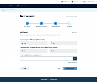
Website Sitemap and User Flows
Initial website baseline, features and products identification, ideation on future-state user engagement

Insperity.com Internal Announcement
Worked with some of our incredible Agency Videographers to produce an announcement vid for internal audiences.
ServiceNow Portal Enhancement
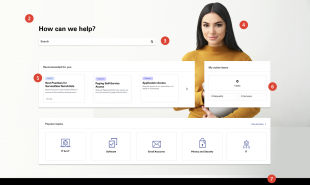
Small team of designers and developers working with the client directly to enhance the overall UX and Employee experience.
Brand re-launch
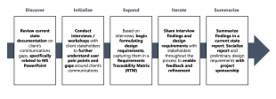
Consulted with a financial client on optimal ways to re-launch a new global Brand re-design
UX/UI Practice
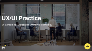
Go to Market deck for UX/UI Practice. Showcase of team capabilities. working process and project examples
Executive Portal Example
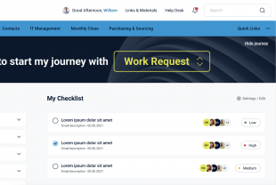
Design exercise to create a dashboard for Executive Leadership; application integrations, single-source-of-truth
Digital Design System
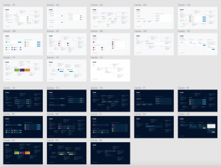
Creation of a “complete” Digital Design System to work with Oracle Apex, based on client requirements and collaboration
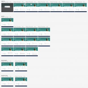
ServiceNow Portal Prototype
Prototype experience to test internal user feedback and application enhancements
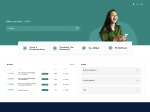
ServiceNow Portal
Design example/exercise for a client to create an improved User Experience for internal users
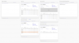
Application Wireframes
Creation of flows and User/Functional Requirements based off defined Persona Profiles
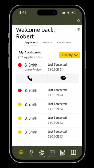
Mobile Recruiting
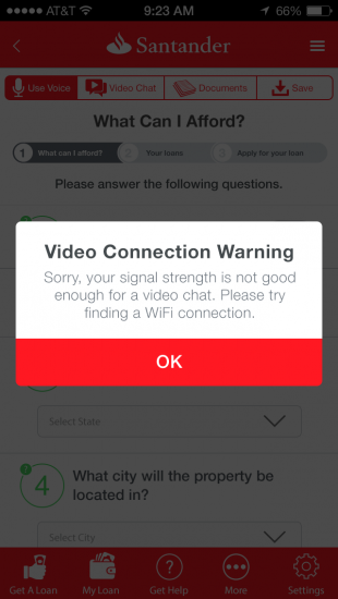
Prototype for an Industry Day presentation showcasing Mobile and Laptop prototypes of Recruiter and Recruit future-state experiences.
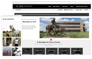
Association Website
Extensive UX/UI Research, User Interviews, Persona Profile creation, Lo-Fidelity & Hi-Fidelity Design Comps, Hi-Fidelity Prototype, User Testing, Change Management and a completely new CMS implementation
Dealer Parts Expo
Brief excerpt from my presentation at the Dealer Parts Expo in Ohio, December 2019

Portal Concept
Proposed new UXD Portal Experience for a potential client. Closed-environment for professionals to share, network, congratulate, earn, aspire and dedicate time to.
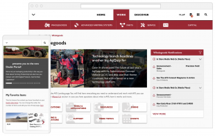
Global Dealer Portal
Update to an existing Dealer Portal that supports dealerships around the world, in multiple languages with multiple brands available based on user profiles

Web Usability Presentation
I originally built this presentation in 2015, but I modified it in 2018 (updated it) to align with Base22 principals and learnings.

Mobile Website Experience
This proposed mobile website was special to me (for the time). I was proposing things to consolidate multiple channels, multiple integrators, multiple design systems and multiple departments into a cohesive experience. There are many small (purposeful) design elements integrated throughout, but at the end of the day this concept was denied. Now, that being said, it showed our client a different view of our company so it was still a successful exercise.

Zillner Responsive Web
New Zillner website which is Responsive for mobile devices; Executive Creative Director
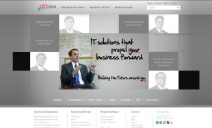
Corporate Website
Proposed option for a human-centered approach to business stories, from a consultant point of view
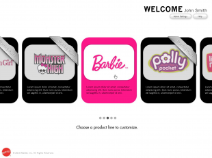
Digital Manufacturing Solution
Design, Information Architecture, Workflows, Color Theory and Workshop Ideation
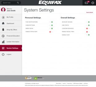
Digital Portal Experience
Created an experience for users to access personalized deals and offers via an onsite workshop

Link
The app was just released in iTunes and Google Play as a companion to the existing web experience

Forest
Like most of my pieces, I was looking out one morning and the sun was just coming up. I couldn’t get the image out of my head until I painted it out

Product Specific Icons
A set didn’t exist while searching for icons to use in promotions… so I created a set

HRB Post Mortem Vegas Theme
We did anual end of season post mortem’s; one season it was a Vegas theme

Campaign Tie-in
Willie Nelson did a spot for HRB. We promoted it leveraging a storyboard I created to tie-in with broadcast spot

Doak Aircraft
Doak Aircraft was a real company. I have some assorted item from the company. I had planned on creating an archive site for the company but have not done so as of yet…

Birthday Announcement
For my son. Funny enough, the back story on the night prior to his party is quite entertaining. Ask me sometime (I’m not allowed to disclose any details online)

Big Head Group
I made it. I know someone asked me to make it. I know it was used for something. For the life of me I can’t tell you anything more about it

60 Second Interviews
I would grab senior members in the hallway, prep them for a minute then shoot them for a minute on topics like future releases, current promotions, staffing, etc. All viewed internally

Digex Baseball Cards
I collect a sigle baseball player from the 1900′s. I got the idea from that for one of our team functions. Each team member was to have a personal card. The set was never completed

Product Promotions
Again, one in a series of 20-30 ideas. This one has always been my favorite (so many inside jokes)

Internal Campaigns
I was allowed a great deal of creative freedom while at Digex. I was encouraged to produce print, multimedia, video, web, animation, photography and strategy on implementing best user practices for a slew of software solutions

Flawlessphoto.com
My first online portfolio. It changed from a portfolio site to a wedding photography site back to a portfolio site and now sits as an archive of my favorite photos

Southwest Project
While at Rochester Institute of Technology (RIT) I spent a summer shooting in the Southwest for credit. I have been working on a site for over a decade to publish all the images. I’m still working on it

Live Picture Pepper
Designed to work with extremely high resolution digital photographs, Live Picture allowed the user to manipulate images without additional artifact distortion. And that is an original photograph of my own using strobe photography and a .22

